Newcastle United’s new 2012/13 home kits pictured at Chemnitzer friendly

Posted on July 13th, 2012 | 9 Comments |
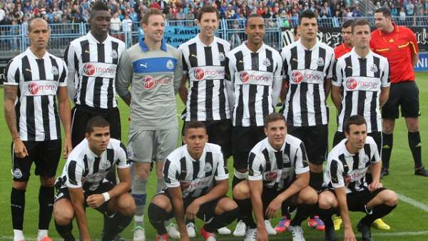
NUFC / Newcastle United new home kits 2012/13.
New NUFC home and goalkeeper shirts finally released into the wild!
At last! A definitive picture of Newcastle United’s new home kit on display at the friendly against German lower league side, Chemnitzer, earlier today.

The Magpies lost 1-0 incidentally with Chemnitzer’s Anton Fink striking what was to be the deciding goal for the home side after only ten minutes.

As you can see, both the outfield players’ shirts and the goalkeeper’s shirt are no different from the shirts we revealed in this story way back in January of this year, as well as this one back in June, the only difference being the new sponsor’s design on the front.

As to whether Mike Ashley’s Sports Direct will be undercutting the club’s official outlet once again when the kit is released at the beginning of next month remains to be seen.

What do you think now you’ve seen them on some live models?

Poll

NUFCBlog Author: workyticket workyticket has written 1095 articles on this blog.

Related Posts:


9 Responses

  1. Prefer it it be Black ‘n’ White, rather than White ‘n’ Black, personally…if you know what i mean?
    It’s ok though, simple, minimalistic, not trying too hard.

  2. I like it. It’s different, but it’s still “Black ‘n’ White” regardless. All we need is a few world-class players before the season kicks-off and the kit will start blinging!

  3. Thought it looked ok when viewed from the front, but the enormouse white number square on the back is dumb.

  4. Chuck: the white square is a way for the former fat man to extract more dosh. The top looks stupid without a name and number on it now, so kids will be paying a tenner extra for an iron on that costs a pound.

    That’s my conspiracy theory anyway.

  5. I keep saying I prefer ‘black & white’, rather than ‘white & black’, and no one knows what I mean. I really don’t like this kit, think it’s ugly. Should’ve kept the Virgin logo background black, then it would be fine!

  6. Ryan says:
    August 2, 2012 at 2:40 am

    “I keep saying I prefer ‘black & white’, rather than ‘white & black’, and no one knows what I mean.”

    Well I do, Ryan, it’s simple. You want a “negative” version of the one in the picture above with black on the shoulders, rear, armbands etc instead of white.