Newcastle United 2012-13 shirts unveiled (pictures)

Posted on January 24th, 2012 | 31 Comments |

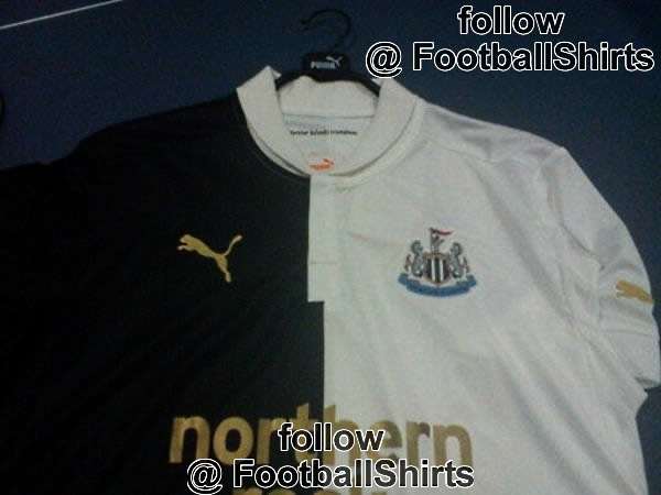
NUFC 2012-13 shirts home and away .
2012-13 home and away shirts - see the others below.
Pictures of the forthcoming 2012-13 season shirts have were released into the wild late yesterday evening and here they are!

Of course, you will notice that the shirts still bear the sponsor’s name of “Northern Rock” rather than the new “Virgin Money” as these shirts were mock ups made before the latest sponsirship deal was confirmed. Please see below for larger images of the full range, or all the pictures we received anyway. First of course is the home shirt, which looks like the usual Puma quality (I know), but in it’s favour, it does look like the first proper Newcastle United home “Magpie” shirt for quite some time, with the black and white stripes covering the whole shirt. Writing personally, this a welcome change from this season’s, which made the players (and most of we fans) look like we’d been the victim of a hit and run by a vehicle with white tyres.

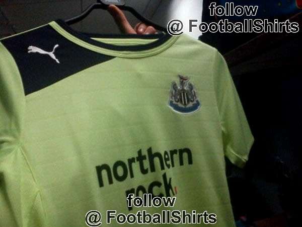
After the home shirt comes the interesting “halved” shirt, which I actually quite like. I’m presuming that this is the away shirt but please don’t quote me on that just in case! The next ones up are high collared goalkeeper’s jerseys, the first being grey with blue horizontal stripe and the second a indigoish-purpleish colour with the stripe and collar in grey. Finally there is a light lime green one, which with it’s different collar looks like it’s probably a training shirt rather than a third shirt, which will probably come out later anyway. Once again, don’t quote me on that.

What do you think?

Newcastle United home shirt 2012-13.
Newcastle United home shirt 2011-12 (large).


Newcastle Unted away shirt 2012-13.
Newcastle Unted away shirt 2012-13 (large).


Newcastle United goalkeeper shirt 1 - 2012-13.


Newcastle United goalkeeper shirt  2 - 2012-13.
Newcastle United goalkeeper shirt 2 - 2012-13.


Newcastle United green shirt  2012-13
Newcastle United green shirt 2012-13


Thanks to Football Shirts.co.uk.

NUFCBlog Author: workyticket workyticket has written 1095 articles on this blog.

Related Posts:


31 Responses

  1. First impreesions, they look s#@t. Brilliant foresight to have the away (change) kit the exact same colours as the home kit. TBH be thankful that the kit is not made by Donnay, Dunlop, Ocean Pacific, or any of the other s#@t brands that our owner peddles from his store.

  2. im assuming the logo will be black in the middle which would make it better and if the material is like this season one it will be good :)

  3. I think the half white half black jersey looks nice, its a shame though the black alternates we have this year are one of my all time favorites. Im just glad to get rid of the orange jersey, I hate looking like wolves.

  4. steve says:
    January 24, 2012 at 8:30 am

    “Northern rock? Dont think so. Its too early to be seeing next seasons strips.”

    They could still be tweaked a little at this early stage Steve (apart from the sponsor bit obviously), but there’s about a 95% chance that these will be the shirts.

  5. The home top is way better than the current one, though i prefer an all black away top, the half/two/tone one isn’t bad.
    Better than recent efforts, other than the current away top.

  6. I thought Puma only had a two year deal? Was also hoping for Nike (over anyone else) to sponsor the stadium name with the shirts thrown in as well.

  7. goodoldjimgold says:
    January 24, 2012 at 11:16 am

    “I thought Puma only had a two year deal? Was also hoping for Nike (over anyone else) to sponsor the stadium name with the shirts thrown in as well.”

    Four years Jim.

    That Nike thing was always a phony story, but it kept the fans quiet for a while over the rename for a crucial period until they calmed down.

    Before Virgin came in the cipher of Satan said:

    “Puma need to put the shirt sponsor on, they’re manufacturing, and they would like it last month.”

  8. I like the look of the home shirt will look ok with new sponsors name on it, black and white for an away is stupid we will never wear it. go back to yellow with green trim or blues. i wont be buying any shirts as long as M A is at the helm he may have bought us a striker recently but takes an age to realise the squad needs these players,and renaming sjp is scandalous so i think he still has a long way to go to turn things around

  9. “there’s about a 95% chance that these will be the shirts.”

    Any chance you can actually prove to us that it’s 95%??

    Personally I think our current home kit looks alot more stylish and if we kept it going the kits would of been remembered as the Pardew years.. ah well

  10. Surely a half black/half white away shirt is the same as a black and white striped shirt. Utterly pointless. I’m sceptical that these are anything more than a first mock up of one possible new strip, if that

  11. 1. too early in THIS season to know what next seasons strip will be.

    2. looks like a group of 9 year olds made it behind a shop. surely we are paying them enough for the expert 12 year olds to make it.

    honest opinion. they look like a cheap knock off brand that will get sold over seas. even though I wear the tops to support Newcastle and not *only* for a fashion statement, I would not buy them or go to a game with one on.

  12. Hate that half & half top! I hope im wrong and they are not thinking of that top as a possibility as the home shirt, its black and white afterall!

  13. Wish they would stop changing them, to be honest.
    Away tops? How many times do we really wear them? pointless

  14. They might just be a prototype. I’ve seen a few prototypes in my time. One was a mock up of the Granada style top we had. It looked similar but completely different to the ones the players wore. Was more like the old unbroken strip but with addidas markings in the stripes when you look closer. This might be a prototype of the strips we will eventualy see. But if you look at last seasons strips they looked very much like the 76-80 bukta umbro kit we had. This strip looks very much a like the strip with the greenalls beer written on the front. The logo was boxed and had white backing with black boxed border. At least it goes to show mike and lame arse are least walking down the Newcastle hall of fame.

  15. robomag says:
    January 24, 2012 at 8:35 pm

    “Wish they would stop changing them, to be honest.
    Away tops? How many times do we really wear them? pointless”

    You know why they all do it though robomag.

    “Newcastle fans are mugs for paying £30.00 for shirts that cost us £5.00 to make.” That was Fat Freddy in a Spanish brothel, but it could just as easily have been Ashley or indeed any other football club owner.

  16. watched the match can see why newcastle want zaha has the pace and trickery,now that palace are out of the cup wonder if newcastle will bid for him again with a couple days of the window left

  17. the 1st Puma kit we had was cool not a big fan of the new 1 but i wear it all the time none the less… well i wear the away strip more often, i dont believe for a second that these are next seasons kits… get Adidas back we used to have amazing looking jerseys , the home kit in the championship season was perfect … an ill be honest kinda liked the yellow one as well haha

  18. Look ok !
    Least somebody knows what black and white stripes look like, the half n’ half looks ok too, the rest eeeaah !

  19. I think the two goal keeper shirts are to fool harper he is still first choice keeper at a club………have you seen the Brighton goal keeper shirt? Bizzarly similar.

  20. I don’t like any of these shirts I think Ill save my money and wear this seasons shirts

  21. what I cant understand is Mike Ashley was charging fans 5 quid to get the Northern Rock logo covered with the Virgin money logo.Then changes it back to Northern Rock.A shirt is a shirt to me but all the young kids who like to be a replica of their hero`s is not fair.